
Physician practices, payors, and health system leaders rely on key performance indicators (KPIs) to achieve their clinical, financial, and operational goals.
For care management programs, it’s key to monitor appropriate measures and trends because it helps providers maximize existing resources. Data metrics can also aid their decision-making to improve outcomes, enhance patient engagement, and lower overall costs.
ThoroughCare Analytics provides near real-time care management data to support insightful clinical analysis. Analytics cover five measurement areas, including:
- Strategic data
- Clinical data
- Engagement data
- Financial data
- Operational data
Our platform reports everything that a healthcare leader needs to improve overall care quality.
Strategic KPIs
ThoroughCare’s strategic KPIs provide an overview across all areas – clinical, financial, and operational – and speak to the overall health of the care management program. Additionally, these metrics highlight various aspects of a program that encourage discussions and analysis to make high-level improvements and changes.
ThoroughCare’s top 3 reports and dashboards for strategic KPIs
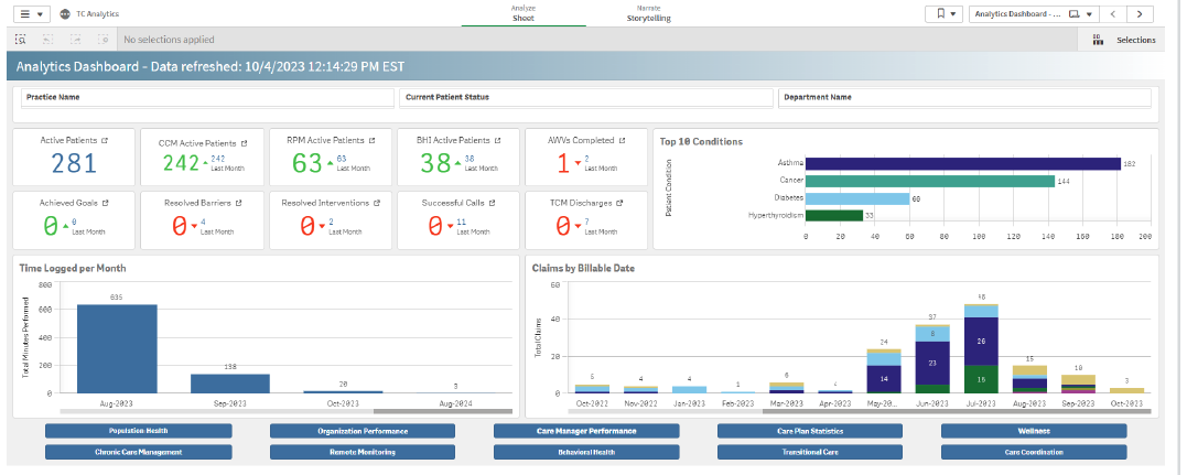
Analytics Dashboard
The Analytics Dashboard includes a breakdown of metrics for each program over time. This allows providers to monitor ongoing performance and identify trends. Thereby, enabling care teams to proactively improve processes, operations, and outcomes.
The most valuable KPIs found in this dashboard include:
- Number of active patients plus a breakdown by program this month vs. last month
- Number of AWVs completed this month vs. last month
- Number of goals achieved across programs this month vs. last month
- Number of barriers resolved across programs this month vs. last month
- Number of interventions resolved across programs this month vs. last month
- Number of successful calls completed this month vs. last month
- Top 10 conditions and the number of patients with each condition
- Total minutes performed over time month and year
- Number of claims per program (RPM, CCM, ACP, AWV, TCM, BHI) over time (month and year)
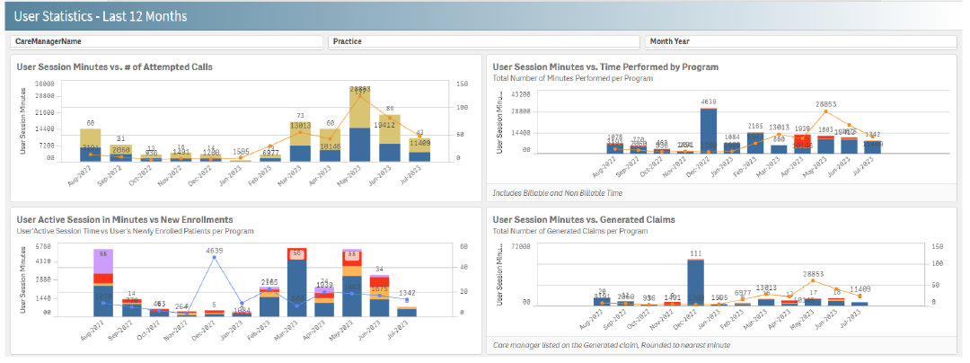
User Statistics Report – Last 12 Months
This report gives a snapshot of program volume, activity, and trends over the past year. It helps organizations track and understand user behavior such as calls, time performed by program, engagement, session minutes compared to claims generated, and trends over time.
Data visualizations include:
- User Session Minutes vs. Time Performed by Program
- User Active Session in Minutes vs New Enrollments
- User Session Minutes vs Generate Claims
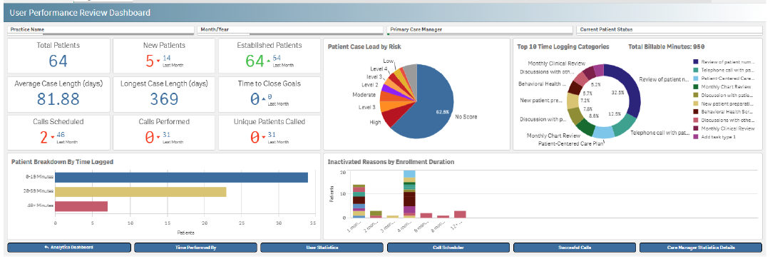
User Performance Review Dashboard
The User Performance Review Dashboard supports employee performance oversight by identifying user behavior patterns and engagement levels. Users can see the most common reasons short and long-term patients were inactivated, helping to set performance improvement goals.
Sample data visualizations by care manager include:
- Total patients assigned
- New patients assigned and enrolled in the past 30 days vs. last month
- Established patients enrolled more than 30 days compared to last month
- Average case length (days)
- Longest case length (days)
- Time to close goals shows the average time it takes to close goals this month vs. last month
- Total number of calls scheduled this month vs. last month
- Total number of calls completed this month vs. last month
- Total number of patients the care manager attempted to call (successful and unsuccessful) this month vs. last month
Clinical KPIs
ThoroughCare offers the following clinical metrics through reports and dashboards:
- Patient Demographics Dashboard
- Patient Stratification Dashboard
- Patient Stratification Report
- Patient Vitals Dashboard
- Population Health Dashboard
- Assessment Details Report
- Barriers Report
- Notifications Worklist Report
- Care Plan Item Details Report
- Care Plan Statistics Dashboard
- Goals Report
- Interventions Report
- Gaps in Care Report
- Medication/Allergy Report
- Conditions Dashboard
Three reports and dashboards provide a comprehensive overview of the clinical activities the patient is engaging in with the team, as well as overall health status and clinical trends.
ThoroughCare’s top 3 reports and dashboards for clinical KPIs
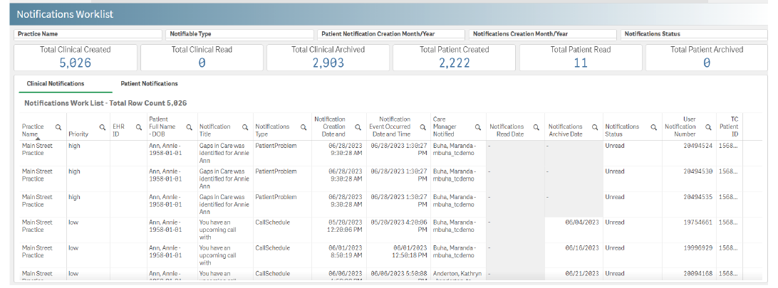
Notifications Worklist Report
The Notifications Worklist provides a comprehensive view of the volume and use of notifications, indicating how responsive the patient and their care team are to prioritizing and resolving clinical issues.
Reported KPIs include:
- Clinical notifications created
- Clinical notifications read
- Clinical notifications archived
- Patient notifications created
- Patient notifications read
- Patient notifications archived
Patient Stratification Report
The Patient Stratification Report provides a wealth of information across a patient’s clinical profile. Identifying high-risk patients across several categories helps providers view patient data to optimize care delivery, improve patient outcomes, and ensure the efficient use of resources.
Key stratification data include:
- Highly Comorbid: Patients managing three or more chronic conditions
- Chronic Future Risk: Patients over 65 with one chronic condition and additional associated risk factors, volume of medications, or number of primary care visits in the last 12 months
- Frequent ER: Patients that have visited the emergency room three or more times in the past year
- Frequent Inpatient: Patients admitted to the hospital two or more times in the past year with at least one chronic health condition
- Smoking Cessation: Patients who are currently active smokers and wish to quit
- Risk for Readmission: Patients recently discharged from the hospital within the last 90 days have a high risk of being readmitted due to their health status
- Long-term Services and Support: Patients aged 65 or older who require assistance with Activities of Daily Living (ADLs) or Instrumental Activities of Daily Living (IADLs)
- Behavioral Health: Patients dealing with behavioral health conditions
- Weight Management: Patients with a Body Mass Index (BMI) indicating obesity or underweight
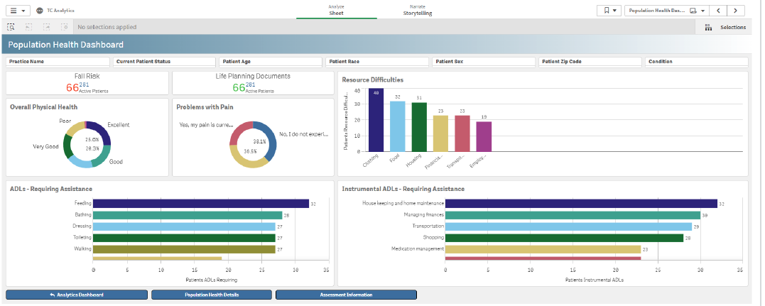
Population Health Dashboard
The Population Health Dashboard equips providers with key clinical measures across the entire patient panel or a subset, including metrics like fall risk, completed life planning documents, how they rate their overall health, resource difficulties, pain, and needs related to activities of daily living.
By leveraging these data-driven insights, the dashboard supports evidence-based decision-making at the individual and population levels.
Main report KPIs include:
- Fall Risk: Number of active patients at risk for falls vs. last month
- Life Planning Documents: Number of active patients with life planning documents vs. last month
- Resource Difficulties: Number of patients with specific resource difficulties
- Overall Physical Health: Percentage of patients by overall physical health rating
- Problems with Pain: Percentage of patients across three pain categories – no routine pain, adequately managed pain, currently unmanaged pain
- ADLs Requiring Assistance: Number of patients requiring assistance with specific activities of daily living
- Instrumental ADLs Requiring Assistance: Number of patients requiring assistance with specific instrumental activities of daily living
Engagement KPIs
Engagement KPIs give an overall picture of patient volume, interactions, and activity. This helps care managers and provider leaders know whether their interventions are having an impact.
ThoroughCare’s top 2 reports and dashboards for engagement KPIs
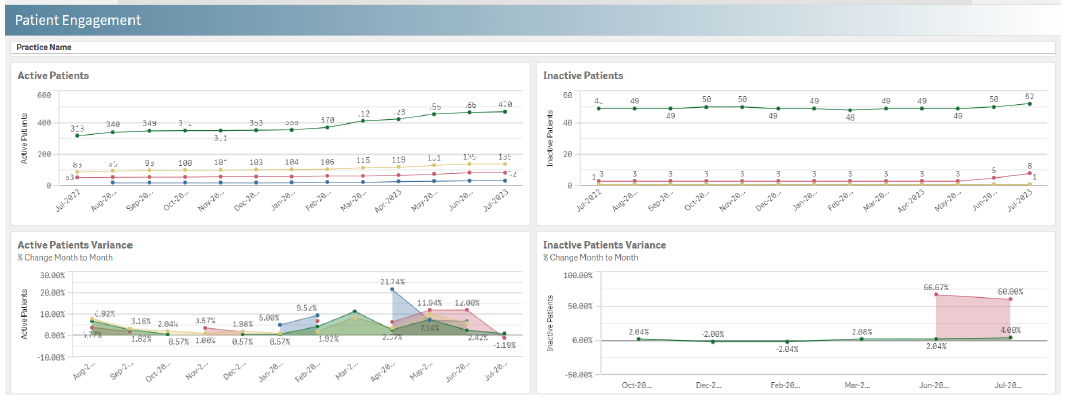
Patient Engagement
This dashboard displays patient engagement status over time and across all care management programs, providing insight into patient behavior, preferences, and interactions.
Key dashboard visualizations include:
- Trends in the number of active patients per month and year in each care management program
- Trends in the number of inactive patients per month and year in each program
- Percent change in monthly number of active patients per program
- Percent change in monthly number of inactive patients per program
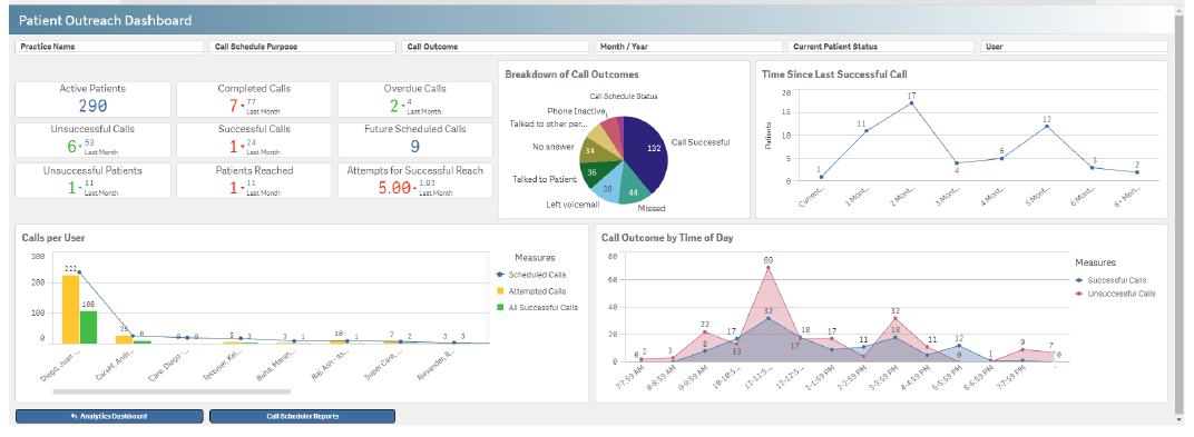
Patient Outreach Dashboard
Providing a detailed view of call scheduling trends, performance metrics, and operations, this dashboard enables supervisors and managers to make data-driven decisions and optimize call efficiency.
The visualizations support call volume and pattern analysis by recording the date and time of every call. It also tracks call outcomes like successful calls, reached, talked to someone other than the patient, left a voicemail, no answer, inactivity, or attempted calls.
Data visualizations include:
- Number of active patients
- Number of successful and unsuccessful calls completed this month vs. last month
- Number of missed calls that are overdue this month vs. last month
- Number of unsuccessful calls this month vs. last month
- Number of successful calls this month vs. last month
- Number of calls scheduled in the future
- Number of unique patients attempted to be reached but were unsuccessful this month vs. last month
- Number of unique patients successfully contacted this month vs. last month
- Average number of unsuccessful calls completed before successfully reaching a patient this month vs. last month
- Breakdown by call outcomes
- Time since last successful call
- Patient outreach workload per care manager by scheduled calls, attempted calls, and successful calls
- Call outcome by time of day, showing the most successful time of day to reach a patient
Financial KPIs
Financial metrics help leaders ensure that their care management programs services are billed promptly, are reimbursed, and provide insights into how time and effort are tracked and billed.
ThoroughCare offers a host of financial metrics through reports and dashboards, including:
- Billing and Claims Details Report
- Claims Dashboard
- Insurance Coverage Report
- Enrollment History Report
- Claims Report Details
- Time Log Report
- Time Log Dashboard
- CCM Dashboard
ThoroughCare’s top 3 reports and dashboards for financial KPIs
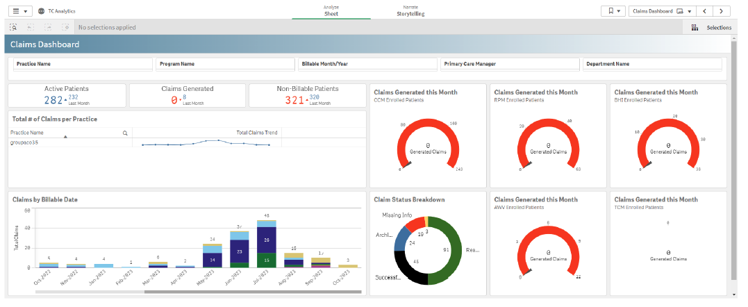
Claims Dashboard
The Claims Dashboard monitors and analyzes claims processing to ensure timely and accurate resolutions. It highlights the volume of claims generated over a specific time, allowing users to identify peaks and trends across the organization and particular programs.
Additionally, this dashboard shows where revenue was lost when minimum service minutes were not reached, or where billing bottlenecks may occur.
The most valuable KPIs found in this dashboard include:
- Number of active patients this month vs. last month
- Number of claims generated this month vs. last month
- Number of patients who did not reach 20 minutes, who failed to complete an AWV, or who failed to complete TCM this month compared to last month
- Claims generated in the current month by program
- Trending total claims per practice
- Total claims by billable month and year by program
- Number of claims per claim status — archived, ready to bill, missing info, successfully billed, on hold
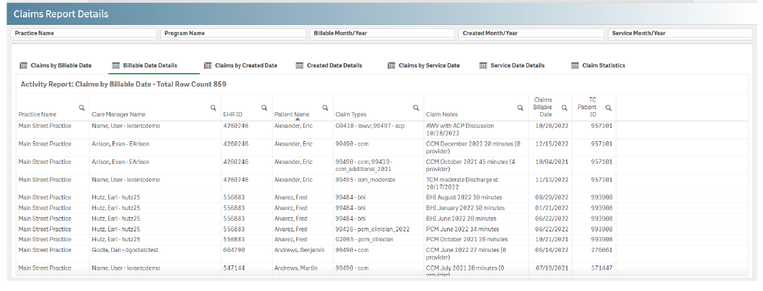
Claims Report Details
This report provides a comprehensive overview of claim details by practice, program, billable date, created date, and service date. Claims statistics provide the total number of a specific claim type within the last 7 days, 30 days, and year-to-date.
This report supports informed decision-making and optimizes claims management processes and overall financial performance by leveraging data-driven insights.
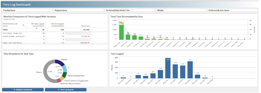
Time Log Dashboard
Having a clear view of how time is used and captured is critical to the success of a care management program. This dashboard visualizes several key time-related metrics across programs, including:
- The amount of time performed in the current month compared to the previous month, including the percentage variance per user
- Billable and non-billable time per care manager compared to patient variance
- The percentage that a task type is logged with any task types used less than 5% in “other” category
- Total amount of time performed each month
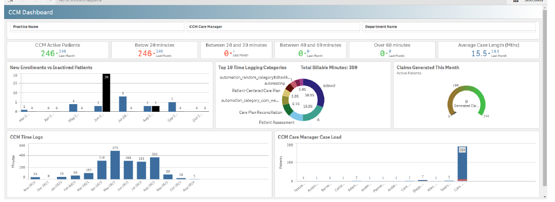
CCM Dashboard
Specific to a Chronic Care Management (CCM) program, this dashboard provides a superb overview of all CCM performance. It covers patient health outcomes, care team efficiency, and overall program effectiveness.
Key dashboard KPIs include:
- Number of active CCM patients this month vs. last month
- Number of minutes below the 20-minute threshold
- Number of minutes between 20-39 minutes
- Number of minutes between 40-59 minutes
- Number of minutes above 60 minutes
- Portion of patients that will be billable that month
- Average time between enrollment and an inactive status
- Number of new patients enrolled in the CCM program monthly compared to the total number of inactivated patients
- Top 10 categories of logged time as a percentage of the total billable time
- Number of claims generated for CCM this month compared to the total number of active patients
- Minutes performed per month and year
- Number of CCM patients by care manager by risk level
Operational KPIs
Various operational data provide insight into how well a care management program is working. Reports give further evidence that can be used to improve efficiency and further scale a successful program.
ThoroughCare’s top 3 reports and dashboards for operational KPIs
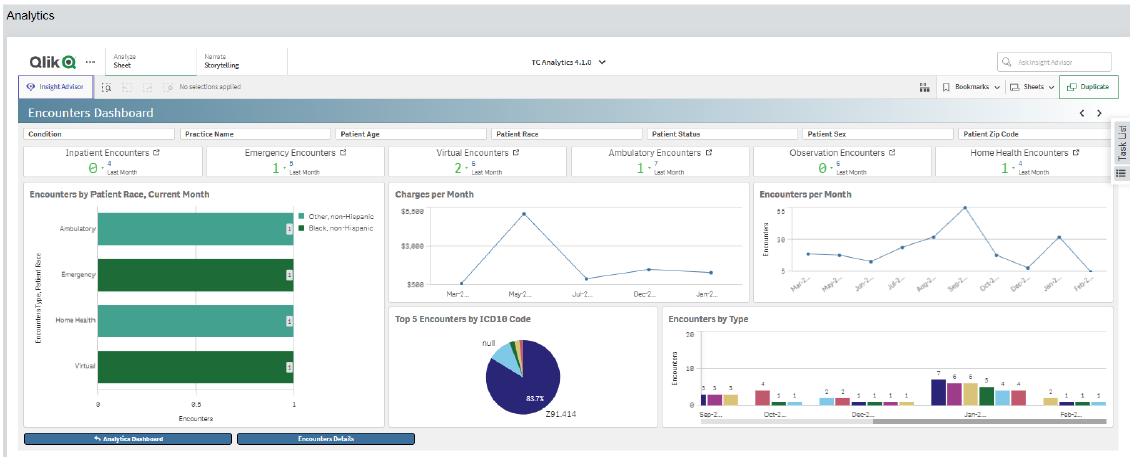
Encounters Dashboard
This visualization highlights utilization data such as the breakdown of encounter types, prevalence among various patient demographics, and trends over time.
By harnessing the insights derived from encounter data, organizations can enhance efficiency, effectiveness, and outcomes in patient care delivery and organizational performance.
Dashboard data and visualizations include:
- Number of inpatient encounters this month vs. last month
- Number of emergency department encounters this month vs. last month
- Number of virtual encounters this month vs. last month
- Number of ambulatory encounters this month vs. last month
- Number of observation encounters this month vs. last month
- Number of home health encounters this month vs. last month
- Number of encounter types by patient race for the current month
- Number of charges from the last 12 months by month and year
- Number of encounters from the last 12 months by month and year
- Amount of top five encounters by primary diagnosis code
- Number of patient encounter types over the past 12 months
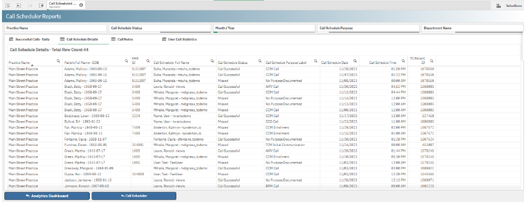
Call Scheduler Reports
This helps leaders analyze call scheduling activities across all patients and programs, identify trends that require improvements, and address issues through data-backed decisions that optimize call handling and achieve communication excellence.
Key metrics reported include:
- Daily successful calls
- Call schedule details
- Call notes
- User call statistics
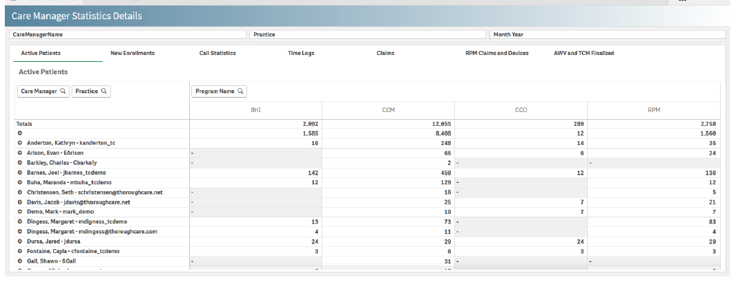
Care Manager Statistics Details
This report provides comprehensive insights into care manager productivity, patient interactions, and outcomes. This enables organizations to assess the effectiveness of care management programs and make data-driven decisions.
Key metrics tracked include:
- Number of new enrollments
- Key call statistics
- Time logs
- Claims overview
- AWV and TCM finalized
ThoroughCare enables complete data-driven oversight and improvement of care management programs
ThoroughCare’s reporting and analytics capabilities provide key performance indicators needed for robust oversight and management of each care management program's financial, clinical, and operational health.
The easy-to-use reports and dashboards also support quality and performance improvement to ensure a program meets its care delivery and patient goals.